Mobility Indicators Infographics
#MobiliytIndicators
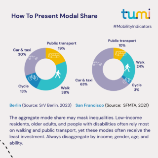
This collection presents the core indicators that define how people, cities and countries actually move and how well their transport systems serve everyone who depends on them. From the share of trips made by foot, bike, and public transport, to the proportion of people making zero trips on a given day, to the distance that officially makes public transport “convenient”. Each indicator translates a policy ambition into a claim that can be measured, challenged, and held to account.
The panels are built for decision-makers, practitioners, and students who want to understand not just what the numbers say, but where they come from, what they miss, and what goes wrong when you compare the wrong figures across the wrong contexts. Every indicator is examined through four questions: What exactly does it measure? What does it systematically fail to capture? How is it disaggregated — by sex, age, income, geography — and why does that disaggregation usually not happen? And what should change in policy or practice if you take it seriously?
More charts covering additional indicators will be added soon. Check back regularly or follow us on LinkedIn to stay up to date with the latest updates